Brand Case Study
NYC Health + Hospitals

NYC Health + Hospitals serves 1.2 million patients annually, primarily the uninsured, poor, and working class within NYC’s five boroughs. It operates with $6.7 billion in annual revenues, employs over 35,000, and manages 11 acute care hospitals, five nursing homes, six diagnostic and treatment centers, and more than 35 community-based primary care sites. The nation’s largest municipal health care system is committed to the concept that everyone has a right to health care, no matter who you are. No one is turned away.
Background
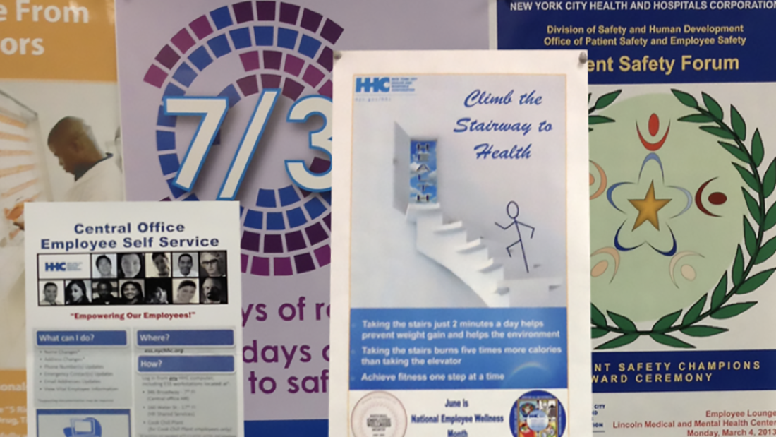
HHC’s heart and soul was it’s 11 hospitals. Spread throughout the city’s five boroughs, each facility has its own history (some dating back to the 18th century), its own community, and its own specialties. They operated separately, rarely shared best practices, and were in competition with each other. This splintering enhanced the individual hospital-centric internal culture to the point that employees were not cognizant of HHC, despite the name written on their paychecks. HHC was more of an amalgamation, a thin governmental administrative layer, spread over a disparate group of independently functioning acute care facilities. Visually, there was no singular identity to speak of. With an enthusiastic staff armed with clip art, each hospital and department had its own logo, newsletter, uniform, and mouse pad.
HHC, The Unbranded
The absence of a coherent HHC brand created a vacuum of positive sentiment and perception among patients and the public, which allowed external forces to make inferences about HHC that may or may not reflect reality. The result is that HHC had little or no control over how it connected with the perceptions of people and the media. There were other ramifications:
- Corporate fragmentation inhibited the sharing of ideas and information over the enterprise, producing extraneous, unaligned, disjointed corporate messages
- Perceptive and emotional increase in corporate size and bureaucracy
- Duplication of efforts increased costs; personnel being diverted from original hired jobs; wasted productivity
- Proliferation of poorly designed communications and solutions
NYC Health + Hospitals
The hospital-driven nature of HHC’s model, inherent siloing, and lack of solidarity made HHC a large, immovable object at a time when it so desperately needed to shift. Unifying the system was critical.
The initials, HHC, meant nothing from a visceral or historical standpoint for reasons mentioned. Another element was New York City itself. Local health care competition began calling themselves ‘New York’s health system,’ and with large advertising budgets there was concern this might have some resonance. But no other system mirrored the diversity of NYC like HHC. In the words of then CEO, Dr. Ram Raju, “We are unique, because we are the only system where we look like our patients, and our patients look like us.” In the complicated and confusing world of health care – and HHC itself – a descriptive and literal label was deemed necessary. HHC transformed into NYC Health + Hospitals. The simplicity of the logotype, in comparison with competitor brands, successfully illustrates how the health system not only emerges visually, but how it retains ownership of its marketplace – New York City. Further, the solution allows for complicated design issues such as facilities, initiatives, and internal departments to all exist within one brand – working as one system, not unlike the organizational structure that HHC strives to be.


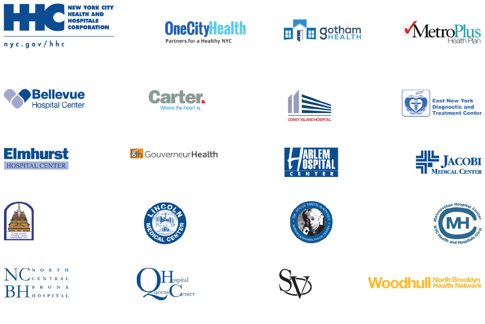
Regarding the integration of facilities into the mark, each health center had its own naming structure – Bellevue Hospital Center, Lincoln Medical and Mental Health Center, Jacobi Medical Center – with no standardized naming practice, and in some cases a moniker six words long. All facilities were shortened to a single word identifier. Segundo Ruiz Belvis Diagnostic and Treatment Center simply became Belvis. Dr. Susan Smith McKinney Nursing & Rehabilitation Center became McKinney.
Name structures were just the start. At the core of the brand initiative was the need to simplify and standardize every aspect of the visual identity. Newsletters, flyers, brochures, posters, ad panels, email, web pages, uniforms, vehicles – all were redesigned and reproduced in sanctioned, standardized templates. Easy access to template materials, as well as logos, lockups, photography, and illustrations were made available on a newly created intranet brand page, with accompanied instructions for use. All of these elements and more were encapsulated in a brand guidebook, describing in detail how, why, and where to use elements and materials. To ensure compliance, brand ambassadors were appointed at each facility, charged with reviewing materials in both visual and editorial content. A second layer of compliance was instituted at the point of production: internal print shops were trained to deny or revise materials that did not comply with the brand. And finally, each facility received networked hardware and software to share projects, ideas, and assets with facility graphic artists and web managers.
Considering the independent nature of each facility, there was fear employees would resist the change. Surprisingly, this was not the case. Most staff were pleased with the ease of creating materials without the need to design them. Content became the focus, and not the design – and that was the point. Tremendous effort went in to creating standardized sets of materials that allow employees to do their job and move on – everything from an electronic business card ordering system, to standardizing wallpaper and furniture for newly opening facilities. In addition to these branding benefits, other positive achievements became apparent:
- The brand was now centralized and better controlled
- System-wide initiatives and communications more easily implemented
- Significant cost reductions in overall print, web, and environmental production
- Workforce galvanized; less of a burden to compete; increased team building; facility lines blurred
- Immediate ability to capture and establish external messaging consistently

Conclusion
NYC Health + Hospitals’ goal to reduce the perceptive size of the health care system, enhance its identity to the community, tear down stubborn walls and boundaries, implement simple design solutions for communications and initiatives, reduce clutter and waste, and its ability to better shift policy direction within the ever-changing health care realm has been made easier. In combination with ongoing implementation of electronic medical records, creation of internal communication technologies, and further leadership vision, the brand will see through the promise, that every New Yorker can, indeed, live their healthiest life.